Founded 50 years ago by economist Fritz Schumaher, Practical Action is focused on promoting a way of life that puts people and the planet before profits and exponential growth. The charity has a presence across four regions – East Africa, Southern Africa, Latin America and South Asia – and focuses on using technology to improve livelihoods for communities in developing nations.
In order to help Practical Action “reclaim its role as a unique voice in the development sector”, NB Studio was brought in to deliver a fresh visual identity – one that complements the organisation’s new positioning as “the ingenuity people”.
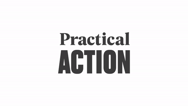
The new branding makes use of clean lines, vibrant pops of colour and a blend of serif and sans-serif typography that sits front and centre across the revamped identity. Simple, clear and weighty, the wordmark feels like an apt representation of the organisation’s name, and the use of different type sizes plays on the idea at the heart of its work – that “small actions can change the big picture”.
“Practical Action’s mission in a nutshell is Small Change, Big Difference,” explains NB Studio creative director Nick Finney. “We used two fonts, Druk and Geller, as visual counterparts to create a succinct and sustainable messaging platform based on this idea of small to big. We gave them the tools to write in a more structured yet natural way, then we worked hard to ensure the messages they write will translate across the globe in many different languages. If the identity looks typographic that’s because it’s all about helping to communicate and amplify their important messages.”
Part of the project involved distilling Practical Action’s wide-ranging work around the world into a clear and confident identity. “They have a lot of important things to say, stories to tell and causes to campaign for so we wanted to encourage clarity and brevity which is sometimes tricky to realise in the charity sector,” Finney says.
It marks a refreshing change of tack from the sometimes convoluted designs seen in the not-for-profit sector – however that wasn’t necessarily NB Studio’s ambition. “We spent a long time looking at and carefully tracing the positioning of peers and competitors in the charity development sector,” Finney explains.
“While this exercise revealed a great deal, from a visual perspective we didn’t necessarily set out to challenge any sector norms. Rather, we knew we wanted to avoid cliché, and that can push you into uncharted territory. When I look back through the work we produced, lots of ideas were left behind because they fell into the former (cliché) or the latter (uncharted territory).
“What we did know was that we didn’t want to impose a visual identity, rather that it should form itself around the things we needed it to do,” he adds. “Our thinking and our designs evolved as we delved further into the project and got to know our client more intimately. The result, we believe, is confidence.”
nbstudio.co.uk
The post Practical Action’s new identity has a loud voice appeared first on Creative Review.