McDonald’s isn’t afraid to use the power of minimalism to its advantage in its advertising. A recent campaign saw the fast food giant coopt its Golden Arches as a way of directing hungry motorists to its nearest outlet, while in another stunt it used nothing but a bit of clever typography to recreate some of its best known dishes.
As the world tries to get to grips with life during the coronavirus pandemic, McDonald’s Brazil has put its Golden Arches to good use again in a new campaign aimed at encouraging social distancing.
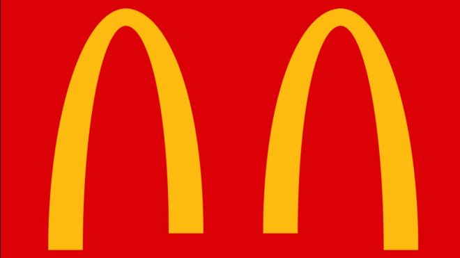
Created by Brazilian agency DPZ&T and running across McDonald’s’ social channels, the stunt sees it split its instantly recognisable logo in two. It comes as the fast food giant is promoting its delivery and drive-in services in Brazil, while it has decided to completely shut all of its branches in the UK.
McDonald’s isn’t the only big brand responding to the new reality of coronavirus in its branding. Coca-Cola launched a campaign in the normally notoriously busy Times Square also encouraging social distancing, Time Out has temporarily changed its name to Time In, and Latin America’s largest ecommerce platform, Mercado Libre, even swapped out its longtime logo of two people shaking hands for the newly certified elbow bump greeting.
View this post on Instagram
Hit the link in our bio to read a digital copy of today’s Time IN, featuring: ???? Our spring preview (full of reasons why London is still blooming great) ???? MP @david_lammy on how the city has shaped him ???? Lesser-known streaming gold for when you’re self-isolating
A post shared by Time Out London (@timeoutlondon) on Mar 17, 2020 at 2:50am PDT
dpzt.com.br
The post McDonald’s reimagines its logo for our new Covid-19 reality appeared first on Creative Review.