It’s been interesting times for the entertainment company this year, with Disney acquiring 20th Century Fox in March – a move to reclaim the missing Marvel characters – and Fox Broadcasting spinning off, becoming independent, and renaming itself Fox Entertainment. So it’s understandable that a rebrand was in order.
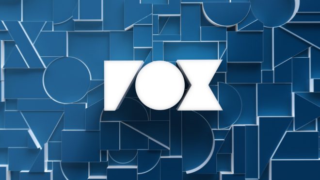
The most notable change is the newly geometric Fox logo, which underpins the whole identity. According to Trollbäck+Company, the studio reduced the mark down to its core components, broke it apart, and then used the pieces as abstract shapes and patterns across the entire rebrand. These ‘broken letters’ will be used in patterns and ‘creative framing’, and play a role in everything from social media posts to huge billboards. The rebrand will now appear across the 17 stations owned by the entertainment company, as well as its 100+ affiliate stations.
According to Alex Moulton, Chief Creative Officer at Trollbäck+Company, the rebrand is intended to position Fox as “an entertainment brand that’s forging culture”. The studio’s Executive Creative Director, Elliott Chaffer, adds, “The way the industry is today, the middle of the road is the best place to get run over. We needed to bring back and champion the brand’s ability to take big swings and bigger risks.”
Just how risky the rebrand is is debatable, but there’s definitely something satisfying about the weighty new letterforms, particularly when they’re seen in 3D and used as part of background patterns. That said, it seems a shame to have lost the definition of the F – which has the unfortunate effect of making the logo read, at first, as ‘Vox’.
With Netflix, the looming Disney+ service and dozens of other streaming companies snapping at their heels, traditional broadcasters and entertainment companies are doing everything they can to stand out – as we’ve seen with ITV’s year of idents, and also the BBC Two rebrand.
trollback.comThe post Fox’s rebrand features a chunky new logo appeared first on Creative Review.