Brand Identity for Sushi Junction by Lee Ching Tat
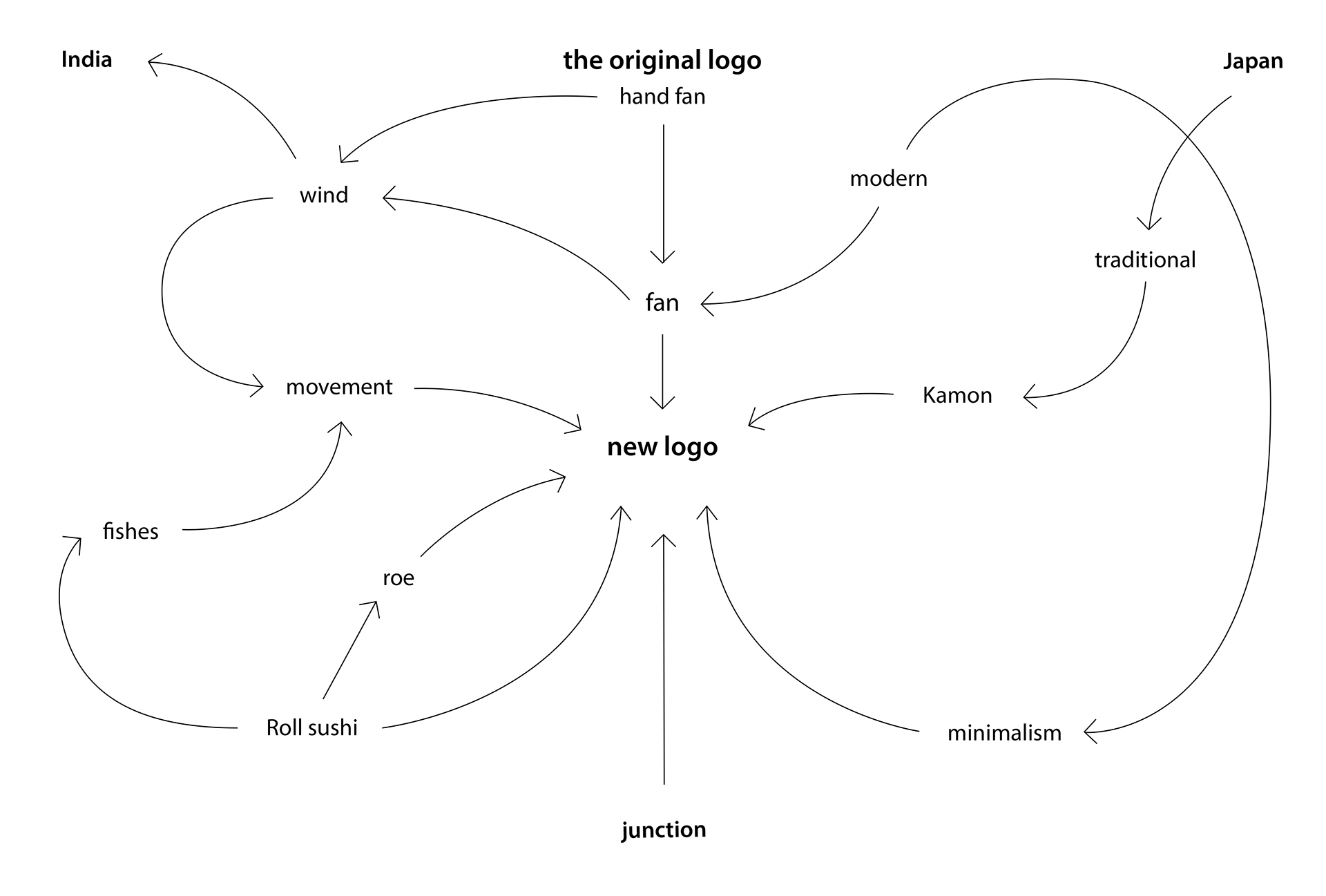
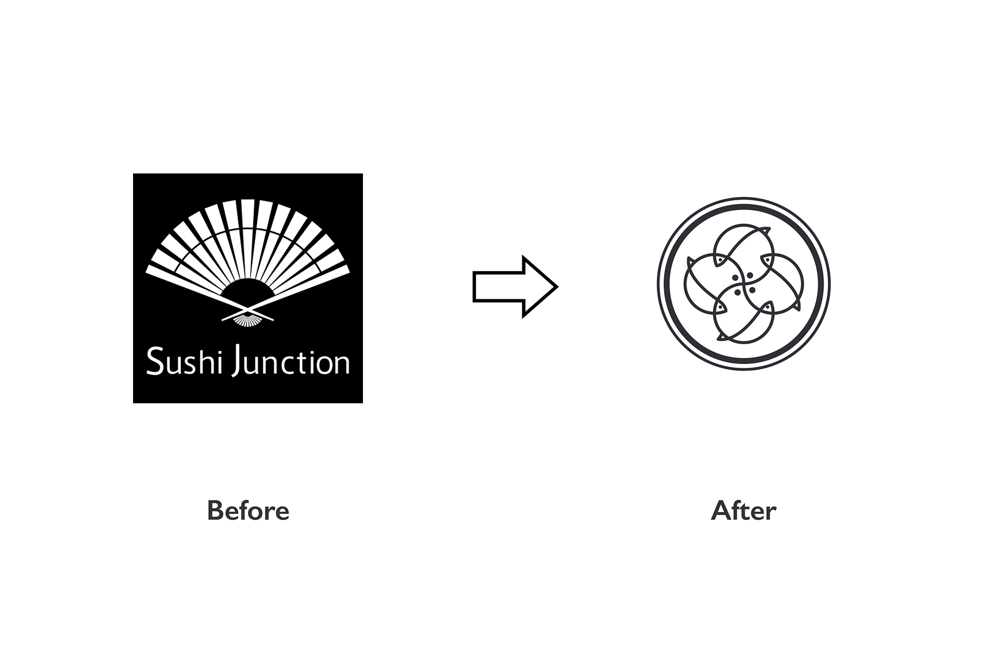
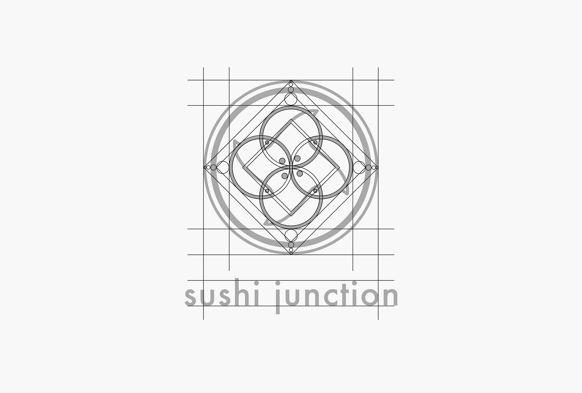
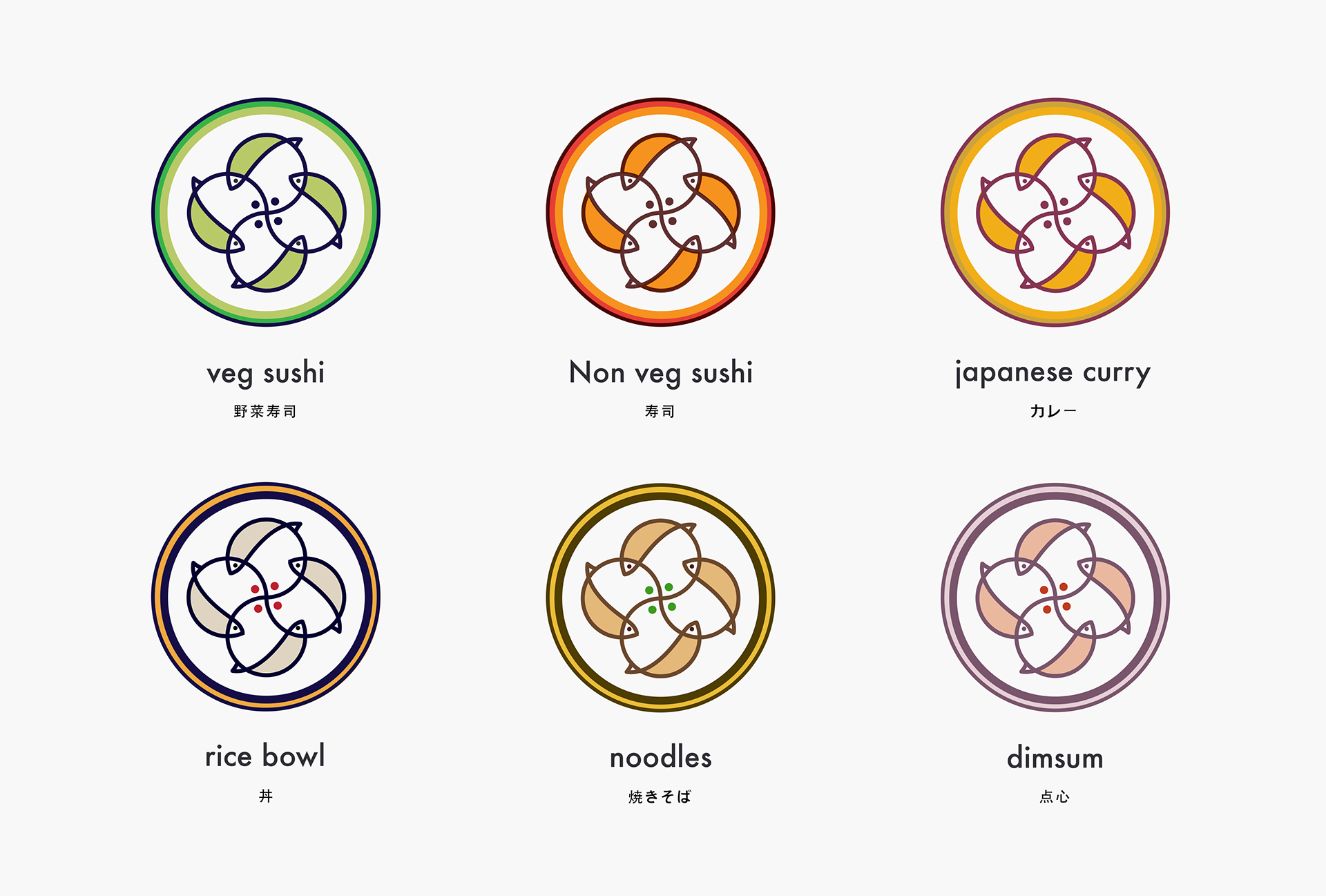
Mortise Design is a brand designer & illustrator based in Tokyo, Japan. He recently shared a brand identity for Sushi Junction, it’s a colorful design mixed with Japanese & Chinese cuisine. It’s really a common thing in Japan seeing many brands taking on their packaging designs to attract customers with limited time and always-on-the-go. What’s interesting about Sushi Junction, It is the first Japanese restaurant in India to offer a wide variety of food and inspired from Indian flavors. The first unit is located in Gurgaon, the second one in Malviya Nagar, South Delhi.
More Links
Brand Identity


AoiroStudio
Oct 17, 2018