Designing a logo for any corporation, brand or cultural organisation today almost invariably requires that the designer also create a bespoke font to accompany it. Sometimes the font is derived from a newly designed mark that has some form of an eccentric character and can be extended to create an entire font. Or the font can be created from a wordmark that could also be extended to a complete alphabet. The font would have to have enough specific idiosyncrasies to create a recognisable visual language that separates it from its competitors.
So much of this activity is facilitated by today’s excellent software in the hands of knowledgeable and talented type designers. I would argue that the technology, talent and knowledge of typographers today make it the best period for typography and type design in my life as a practicing designer. This type movement continues to grow and there is so much wonderful craft to be admired now. But the most recognisable font I have ever seen came out of a logo was designed in the 1960s. The man who designed the font was my future husband, Seymour Chwast. The name of the font was Artone.
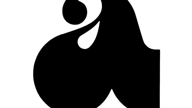
In 1964, Seymour designed a package for Artone Ink, a relatively small company that manufactured art supplies. He designed the lowercase letter ‘a’ with a very extreme, extended lower half. It looked like an ink drop and read as an ‘a’.
The little ‘a’ with a big bottom was instantly recognisable and the package was beautiful. Seymour proceeded to design a whole font of drip-bottom characters. The font appeared on promotions for Artone inks, but other than winning awards in the design field, the font had little impact with broad audiences. The client never maintained ownership over the font, which would be the norm today. Seymour allowed Photo-Lettering, a popular US phototype company, to sell the font, and he maintained a small royalty.
The font became a hit. There were many rip-offs of Artone. All a type company had to do was alter the font very slightly and change its name. In the days before type trademarks and licensing this was very easy to accomplish.
I began to recognise the font Artone when I was a sophomore in college in 1968. It was everywhere. It was a ubiquitous youth culture font. You found it on paraphernalia in head shops, on record covers, underground comics and newspapers, and in youth-culture clothing stores. There were many versions of it, but none as good as the original. Little by little I began to recognise the bastardised versions as different from the original.
At that time, I had no idea Artone came from a logo on an ink bottle package. I thought it looked the way it did because it was visually related to bell-bottom pants, which were all the rage back then (wide-bottomed legs and wide-bottomed letterforms). I assumed it was a hippie font, the way I assumed that fonts that looked like Helvetica and Univers were establishment fonts. I was a hippie of sorts, so Artone was my font.
A year later, in 1969, I began my major in Graphic Design and found out about the Artone ink-packaging. I learned who Seymour Chwast and Milton Glaser were, and I learned about the work of Pushpin Studios. In my beginning days of design I didn’t understand typography. I didn’t understand the Swiss International style. I couldn’t recognise the difference between Helvetica and Univers. (Sometimes, I still have difficulty with that.) But I could always recognise Artone. I could even recognise the rip-offs. It made me love typography.
Seymour has designed a lot of fonts over the years and has sold them through the now defunct Photo-Lettering. (Some of the Photo-Lettering fonts were picked up by House Industries.) Seymour never mastered typographer’s software, and he still draws fonts by hand for his books and posters.
All of the fonts have a recognisable character, but Artone is the only one that coupled with all the bastardisations, came to represent a decade. I don’t know if all the carefully trademarked, licensed or bespoke fonts that are designed today to represent corporation, brands and cultural organisations will ever be able to accomplish that now. Maybe it’s impossible.
seymourchwastarchive.com; pentagram.com
The post A love letter from designer Paula Scher appeared first on Creative Review.