Typography is part of a suite of touchpoints that a brand can use to define and express itself, but according to Jean-Baptiste Levée, CEO of Production Type, it’s much more than just a tool: in the right hands, it’s one of the founding materials of a brand.
“I’ve often heard it said that type can be good or interesting, but rarely both,” says Levée. “It’s relatively easy to have a very expressive typeface, just as it’s easy to make a lot of noise with a lot of musical instruments. You want a quieter voice after a while.”
Levée draws parallels with the fashion industry: “You need outfits for everyday use that are long-lasting, but define your style in the long-term,” he explains. “But on the other hand, you sometimes also need a very flashy outfit for a specific occasion, like a cocktail dress.”
His metaphor also extends to the investment you choose to make: “You can pick up your clothes in a fast-fashion store: it’s cheap, you wear it once and throw it away. Or you can visit a boutique independent designer for something carefully crafted that will last a while.”
Do it for the right reasons
When it comes to brand differentiation, there’s huge value in crafting something individual to aid market standout. But Levée reflects that it’s only fairly recently that custom type has moved up the list of options for many brands. “Until 10-15 years ago, it was reserved for larger brands, and only they would see and verify the benefits. Now, emerging or small brands can access that too.”
A combination of increasingly accessible and affordable tools and a proliferation of type drawing skills has certainly increased the quantity of bespoke type on the market, but Levée reflects that this doesn’t necessarily correlate with quality. “There’s a snowflake effect,” he says. “Everyone seems to be different, but they look kind of the same.”
“Many of the brands we’re talking to come with an intention of having a design head-start to reflect their leadership in a certain sector,” Levée explains. “This is especially true for luxury and fashion brands.”
By the time you’re talking about a six-figure budget it can be more efficient to strike a one-off deal and not think about it again
Other than creative differentiation, are two further layers of benefit for a brand investing in bespoke type. The second is the simplicity of a self-contained one-off deal that bypasses the ongoing headaches of contracts and liability issues. Finally, there are the technical advantages of not having to manage a portfolio of licensed typefaces across an organisation and deal with version control, missing files and other frustrations.
“At some point, purchasing a retained license with constraints isn’t actually an interesting and efficient deal for the brand,” Levée points out. “By the time you’re talking about a six-figure budget it can be more efficient to strike a one-off deal and not think about it again.”
Start the collaboration early
Levée advises starting a bespoke type collaboration at the pitch stage, to identify exactly what’s needed as soon as possible. “We use mood boards and reference materials to quote,” he explains. “That way, we each bring our best: the agency brings the strategy, and we bring our type expertise from the outset.”
It’s important to pick your battles. Production Type actively discourages clients from investing in a fully bespoke typeface if a middle-ground solution will do the job. We first show them our existing typefaces that could solve the brief,” he explains. “Bespoke type is costly, and it can be a long process. Renaming a typeface after a brand and tweaking some characters might solve 80 per cent of your challenges.”
Bespoke type is costly, and it can be a long process. Renaming a typeface after a brand and tweaking some characters might solve 80 per cent of your challenges
That ethos of focusing effort where it counts also stretches to the extent of the bespoke typeface itself. “I usually say, as many styles as necessary, but as few as possible,” explains Levée. “If you’re trying to make a very loud display typeface, it can work in a single style when used in conjunction with another typeface that can speak more softly.”
For entry-level to mid-sized budgets and ambitions, between four and 10 styles are usually sufficient, says Levée. “It depends on the brand, and the skills of the agency commissioned by the brand,” he says. For most designers, Levée believes that six styles – from Light to Black – are ample to address branding, print, advertising and other key touchpoints.
Consider every touchpoint
For larger brands with a range of B2B and B2C applications, a larger family of 10-20 styles may be required. “For a magazine or daily newspaper, it’s critical,” adds Levée. “Your typographic palette must be flexible and versatile, allowing for last-minute changes.”
Production Type collaborated with Paris-based studio Yorgo&Co to create a bespoke typeface for Libération, a French daily newspaper known for its creativity. Its new design required a versatile typeface that could cover the entire canvas of the publication – and nothing suitable existed in the market.
“Jean-Baptiste helped convince the client that this was a serious issue worth spending money on,” recalls Yorgo&Co founder Yorgo Tloupas. “He had very convincing arguments, especially regarding the price they’d have to pay if they bought a font, considering the number of visits on their website. And the typeface definitely helped maintain a coherent global identity for Libération.”
For a magazine or daily newspaper, it’s critical. Your typographic palette must be flexible and versatile, allowing for last-minute changes
Bespoke type can be crucial for weaving personality through every piece of branded communication. “A brand territory often falls apart within the very last stages of customer interaction,” Levée points out. “If intelligently planned, type should remain in every interaction: like shipping confirmation emails, or month-after-purchase questionnaires.”
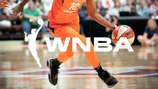
For instance, Production Type’s collaboration with design consultancy Sylvain on a custom typeface for the Women’s National Basketball Association (WNBA) had to cater to a broad range of applications. Sylvain’s original intention had been to build a system based on existing typefaces by female designers – but there was nothing suitable on the market. The agency turned to type designer Hélène Marian and Production Type for something bespoke.
A brand territory often falls apart within the very last stages of customer interaction. If intelligently planned, type should remain in every interaction
“The type family we crafted together is bold and expressive – inspired by the dynamism of the game, the strength and character of its players, and the optimistic and audacious ethos of the brand,” explains Alain Sylvain, founder and CEO of Sylvain. “It brings a unique perspective to sports typography that is ownable to the league and identifiable in culture.”
Display font WNBA Varsity adorns player jerseys, while WNBA Normal is the workhorse text typeface, in six weights. Meanwhile WNBA Condensed and WNBA Extended, each with three weights, add punch to campaign work.
Push creative boundaries
While many designers take issue with the overuse of particular type styles, such as geometric sans serifs, Levée is more concerned with a lack of imagination in general. “Instead of being proud of what they do, some brands behave like that timid teenager in the playground who wants to be invisible,” he says. “That devastating to the visual richness of the landscape we’re living in. We’re fighting against brand laziness and brand shyness.”
“No one will tell you they want to vanish. They will tell you the exact contrary,” Levée continues. “But when they give you references, it’s transparent. They just want to taste like water. Not a specific water, just tap water.”
No one will tell you they want to vanish. They will tell you the exact contrary. But when they give you references, it’s transparent
Production Type’s bespoke typeface for luxury conglomerate Moët Hennessy Louis Vuitton (LVMH) evades a familiar trap for B2B corporate branding: being neutral and dull. “B2B corporate applications are usually not the most savoury ones,” points out Levée. Although its products have world-famous identities in their own right, LVMH isn’t consumer-facing.
Collaborating with Cake Design and the “culturally knowledgeable people” on the client-side, the foundry delved into the roots of French visual vocabulary – culminating in an elegant serif that draws on five centuries of typographic history.
Production Type’s ambition is to create “useful type with an edge”, as Levée puts it. “Technical quality should go without saying these days, but our typefaces are never bland,” he concludes. “We’re a head above in terms of design.”
The post How to find the right type design partner appeared first on Creative Review.