For potential clients and collaborators, a good online portfolio should provide an in-depth introduction to you and your work. Some creators need an extensive online portfolio to show off the diverse range of their practice, while others do better with a very minimal, one-page site.
While each portfolio serves a unique purpose, there are still some common website mistakes that everyone would do well to avoid. We’ve rounded up some of the most typical common problems, along with some advice on how to remedy them.
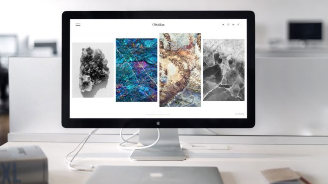
Mistake number 1: Your portfolio needs paring down
Choosing your best work can be challenging, but it’s a crucial step in building a strong website. You might be tempted to upload all your best work to your online portfolio, but including a ton of different projects is likely to leave visitors feeling overwhelmed. You want your online portfolio to serve as a snapshot of your best work, not an image dump of everything you’ve ever worked on. Creating a blog where you share behind the scenes images, personal projects, or updates on what you’re working on is a great way to include more images on your site while reserving your homepage and main galleries for your highest-caliber work.
Mistake number 2: It’s not clear what you do or who you are
While you don’t need to necessarily state your profession right on your homepage, the focus of your work should be clear right away. Showcase images on your homepage that offer a good overview of what it is you do. Include an easily accessible link to your bio, a brief CV, or an “about” page that introduces you and your work. There’s nothing worse than checking out an online portfolio full of incredible work and being left to wonder who created it. Your website should introduce you as well as your creative output.
Mistake Number 3: Your website is disorganised
As you continue to update your site with new work over time, it can be all too easy for your menu and layout to become disorganised. Keeping your menu easy to navigate is crucial for maintaining a user-friendly, professional-looking website. Make sure your galleries are organised in an obvious way—for example by client, year, medium, or type of work. Links to your contact information and bio should always be clearly visible. If your social media accounts are connected to your site, make sure those are in an obvious location as well.
Mistake number 4: Your website’s design feels like an afterthought
Especially for those in the design-focused careers, the design of your site is just as important as the work you showcase. Minor issues such as a confusing layout, boring typography, or clashing colours can all majorly detract from viewers’ perceptions of your work. Keep design front of mind when creating your website, and be sure to choose website builder a with a variety of well-made design options that can help elevate your work.
Mistake number 5: Your work is presented without context
Depending on what kind of work you do, providing background context may be somewhat optional, or it may be crucial. If your website is mostly personal work, for example, it might not be necessary to provide a lot of context beyond naming and briefly introducing the project. If your website is full of client work, you should be sure to identify clients and ideally give some background on each project.
Mistake number 6: You didn’t take time to proofread
Proofreading is absolutely key to ensuring your website is professional and polished. Whenever you make updates to your site, be sure to carefully proofread your additions. Getting a second set of eyes on your site is always a good idea too. Ask a friend or family member to have a look over your portfolio as you continually update it. It’s hard to catch mistakes in your own work, and a fresh perspective can be invaluable in making sure that everything looks top-notch.
Mistake number 7: Your website doesn’t work on mobile
Given that as much as half of all web traffic is mobile, having a personal website that’s not mobile-optimised is a big red flag. When giving your site a final read-through, make sure you view it on a variety of devices, not just your laptop. Your creatively laid out homepage might be too difficult to navigate on a small screen, or you might find that some of your formatting doesn’t translate well on mobile. Checking out your site on your phone will help give you an idea of how many of your visitors will likely experience it.
Mistake number 8: You don’t update your website
It’s been mentioned a few times on this list, but it bears repeating here, as this is a common website mistake: Your online portfolio isn’t a set it and forget situation. You should be regularly refreshing your website with new work, making sure that all your links work, and keeping your contact information and CV current.
format.comThe post Eight common design mistakes on your website (and how to fix them) appeared first on Creative Review.
Eight common design mistakes on your website (and how to fix them)
By Thomasin Creative News556